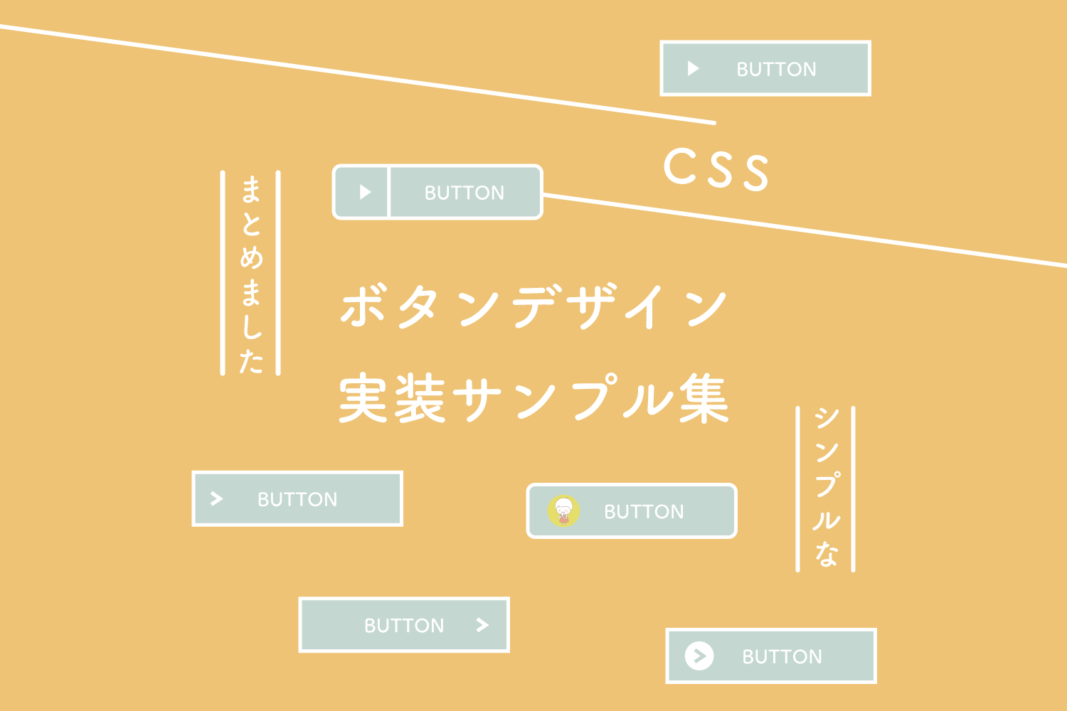
ボタンだー
いろんなボタンをまとめましたー
しっかり企業系のボタン
HTMLとCSSはこちら
HTML
<a href="#" class="btn_01">BUTTON</a>
CSS
a.btn_01 {
  display: flex;
  justify-content: center;
  align-items: center;
  background: linear-gradient(#4fb5ef, #0076b9 100%);
  border: 1px solid #005e94;
  border-radius: 12px;
  box-shadow: inset 0px 0px 2px 0px rgb(255, 255, 255);
  box-shadow: 0px 4px 4px 0px rgb(175, 175, 175);
  box-sizing: border-box;
  width: 100%;
  height: 50px;
  padding: 0 20px 0 70px;
  color: #fff;
  font-size: 16px;
  text-align: left;
  text-decoration: none;
  position: relative;
  transition-duration: 0.2s;
}
a.btn_01:hover {
  opacity: .7;
}
a.btn_01:before {
  content: "";
  display: inline-block;
  width: 0;
  height: 0;
  border-style: solid;
  border-width: 7px 0 7px 8px;
  border-color: transparent transparent transparent #ffffff;
  position: absolute;
  top: 50%;
  left: 23px;
  margin-top: -7px;
}
a.btn_01:after {
  content: "";
  display: inline-block;
  width: 1px;
  height: 100%;
  background-color: #005e94;
  box-shadow: 0px 0px 2px 0px rgb(255, 255, 255);
  position: absolute;
  top: 0;
  left: 50px;
}
HTMLとCSSはこちら
HTML
<a href="https://125naroom.com/web/2846" target="_blank" class="btn_blue"><span class="bl__text">シンプルなボタンデザイン集</span></a>
CSS
a.btn_blue {
    display: block;
    max-width: 350px;
    margin: 0 auto;
    padding: 1.5rem 3.0rem;
    background-color: #1755aa;
    border-radius: 8px;
  box-sizing: border-box;
    text-decoration: none;
    transition: 0.3s;
}
a.btn_blue span.bl__text {
    display: block;
    position: relative;
    color: #fff;
    font-size: 16px;
    text-align: center;
    padding-left: 30px;
}
a.btn_blue span.bl__text:before {
    content: '';
    width: 20px;
    height: 20px;
    background: #ffffff;
    border-radius: 50%;
    position: absolute;
    top: 0;
    left: 0;
    bottom: 0;
    margin: auto;
}
a.btn_blue span.bl__text:after {
    content: '';
    width: 8px;
    height: 8px;
    border-top: 3px solid #1755aa;
    border-right: 3px solid #1755aa;
  box-sizing: border-box;
    transform: rotate(45deg);
    position: absolute;
    top: 0;
    left: 5px;
    bottom: 0;
    margin: auto;
    transition: 0.3s;
}
a.btn_blue:hover {
    background-color: #01b5d0;
}
a.btn_blue:hover span.bl__text:after {
    border-top: 3px solid #01b5d0;
    border-right: 3px solid #01b5d0;
}
@media (max-width: 736px) {
    a.btn_blue {
        max-width: 280px;
        padding: 1.5rem 2.0rem;
    }
    a.btn_blue span.bl__text {
        font-size: 14px;
    }
}
HTMLとCSSはこちら
HTML
<a href="https://125naroom.com/web/2846" target="_blank" class="btn_ao_a"><span class="a__icon"><img src="https://125naroom.com/wp/wp-content/themes/design125naroom/img/kinoko_pan.png" alt=""></span><span class="a__text">シンプルなボタンデザイン集</span></a>
CSS
a.btn_ao_a {
    display: flex;
    align-items: center;
    max-width: 500px;
    margin: 0 auto;
    padding: 1.3rem 2rem;
    border: 2px solid #014897;
    background: #fff;
    text-decoration: none;
    transition: 0.3s;
}
a.btn_ao_a:hover {
    background-color: #e9f3fd;
}
a.btn_ao_a .a__icon {
    padding-right: 4px;
}
a.btn_ao_a .a__icon img {
    width: 36px;
    vertical-align: middle;
}
a.btn_ao_a .a__text {
    display: block;
    flex-grow: 1;
    color: #004386;
    font-weight: bold;
    text-align: center;
    position: relative;
    padding-right: 40px;
    font-size: 23px;
}
a.btn_ao_a .a__text::after {
    content: "";
    position: absolute;
    top: 0;
    bottom: 0;
    right: 0;
    margin: auto;
    transform: rotate(45deg);
    border-top: 3px solid #014897;
    border-right: 3px solid #014897;
    box-sizing: border-box;
    width: 14px;
    height: 14px;
    transition: 0.3s;
}
@media (max-width: 1200px) {
    a.btn_ao_a .a__icon img {
        width: 32px;
    }
    a.btn_ao_a .a__text {
        font-size: 18px;
        padding-right: 20px;
    }
    a.btn_ao_a .a__text::after {
        width: 12px;
        height: 12px;
    }
}
@media (max-width: 736px) {
    a.btn_ao_a {
        max-width: 320px;
    }
    a.btn_ao_a .a__icon img {
        width: 28px;
    }
    a.btn_ao_a .a__text {
        font-size: 14px;
        padding-right: 20px;
    }
    a.btn_ao_a .a__text::after {
        width: 10px;
        height: 10px;
    }
}
HTMLとCSSはこちら
HTML
<a href="https://125naroom.com/web/2846" target="_blank" class="btn_ao_b"><span class="b__text">シンプルなボタンデザイン集</span></a>
CSS
a.btn_ao_b {
  display: flex;
  align-items: center;
  max-width: 500px;
  margin: 0 auto;
  padding: 1.3rem 2rem;
  border: 2px solid #014897;
  background: #fff;
  text-decoration: none;
  transition: 0.3s;
}
a.btn_ao_b:hover {
  background-color: #e9f3fd;
}
a.btn_ao_b .b__text {
  display: block;
  flex-grow: 1;
  color: #004386;
  font-weight: bold;
  text-align: center;
  position: relative;
  padding-right: 15px;
  font-size: 23px;
}
a.btn_ao_b .b__text::after {
  content: "";
  position: absolute;
  top: 0;
  bottom: 0;
  right: 0;
  margin: auto;
  transform: rotate(45deg);
  border-top: 3px solid #014897;
  border-right: 3px solid #014897;
  box-sizing: border-box;
  width: 14px;
  height: 14px;
  transition: 0.3s;
}
@media (max-width: 1200px) {
  a.btn_ao_b .b__text {
    font-size: 18px;
    padding-right: 20px;
  }
  a.btn_ao_b .b__text::after {
    width: 12px;
    height: 12px;
  }
}
@media (max-width: 736px) {
  a.btn_ao_b .b__text {
    font-size: 14px;
    padding-right: 20px;
  }
  a.btn_ao_b .b__text::after {
    width: 10px;
    height: 10px;
  }
}
HTMLとCSSはこちら
HTML
<a href="https://125naroom.com/web/2846" target="_blank" class="btn_ao_c"><span class="c__text"><span class="c__in"><span class="c__icon"><img src="https://125naroom.com/wp/wp-content/themes/design125naroom/img/kinoko_pan.png" alt=""></span><span class="a__one">シンプルな<br>ボタンデザイン集</span></span></span></a>
CSS
a.btn_ao_c {
  display: flex;
  align-items: center;
  max-width: 500px;
  margin: 0 auto;
  padding: 1.3rem 2rem;
  background: #ffffff;
  border: 2px solid #014897;
  text-decoration: none;
  transition: 0.3s;
}
a.btn_ao_c:hover {
  background: #fffbee;
}
a.btn_ao_c .c__icon {
  padding-right: 10px;
}
a.btn_ao_c .c__icon img {
  width: 36px;
  vertical-align: middle;
}
a.btn_ao_c .c__text {
  display: block;
  flex-grow: 1;
  color: #014897;
  font-weight: bold;
  text-align: center;
  position: relative;
  padding-right: 15px;
  font-size: 23px;
}
a.btn_ao_c .c__text::after {
  content: "";
  position: absolute;
  top: 0;
  bottom: 0;
  right: 0;
  margin: auto;
  transform: rotate(45deg);
  border-top: 3px solid #014897;
  border-right: 3px solid #014897;
  box-sizing: border-box;
  width: 14px;
  height: 14px;
  transition: 0.3s;
}
a.btn_ao_c .c__text .c__in {
  display: flex;
  align-items: center;
  justify-content: center;
}
a.btn_ao_c br {
  display: none;
}
@media (max-width: 736px) {
  a.btn_ao_c .c__icon img {
    width: 42px;
  }
  a.btn_ao_c .c__text {
    font-size: 14px;
    padding-right: 20px;
  }
  a.btn_ao_c .c__text::after {
    width: 10px;
    height: 10px;
  }
  a.btn_ao_c br {
    display: block;
  }
}
シンプルな四角ボタン、左に三角
HTMLとCSSはこちら
HTML
<a href="#" class="btn_02">BUTTON</a>
CSS
a.btn_02 {
  display: flex;
  justify-content: center;
  align-items: center;
  background: #fff;
  border: 1px solid #228bc8;
  box-sizing: border-box;
  width: 100%;
  height: 50px;
  padding: 0 6% 0 12%;
  color: #228bc8;
  font-size: 16px;
  text-align: left;
  text-decoration: none;
  position: relative;
  transition-duration: 0.2s;
}
a.btn_02:hover {
  background: #228bc8;
  color: #fff;
}
a.btn_02:before {
  content: "";
  display: inline-block;
  width: 0;
  height: 0;
  border-style: solid;
  border-width: 7px 0 7px 8px;
  border-color: transparent transparent transparent #228bc8;
  position: absolute;
  top: 50%;
  left: 6%;
  margin-top: -7px;
}
a.btn_02:hover:before {
  border-color: transparent transparent transparent #fff;
}
HTMLとCSSはこちら
HTML
<a href="#" class="btn_02_a"><span>BUTTON</span></a>
CSS
a.btn_02_a {
  display: block;
  color: #fff;
  font-size: 16px;
  padding: 1.5rem .5rem;
  background-color: #e22939;
  text-align: center;
  text-decoration: none;
  transition-duration: 0.3s;
}
a.btn_02_a:hover {
  background: #000000;
}
a.btn_02_a span {
  position: relative;
  padding-left: 36px;
}
a.btn_02_a span:before {
  content: '';
  width: 26px;
  height: 26px;
  background: #ffffff;
  border-radius: 50%;
  position: absolute;
  top: 50%;
  left: 0;
  margin-top: -13px;
}
a.btn_02_a span:after {
  content: '';
  width: 6px;
  height: 6px;
  border: 0;
  border-top: 3px solid #e22939;
  border-right: 3px solid #e22939;
  transform: rotate(45deg);
  position: absolute;
  top: 50%;
  left: 7px;
  margin-top: -5px;
}
a.btn_02_a:hover span:after {
  border-top: 3px solid #000000;
  border-right: 3px solid #000000;
}
シンプルな角丸ボタン、右に矢印
HTMLとCSSはこちら
HTML
<a href="#" class="btn_03">BUTTON</a>
CSS
a.btn_03 {
  display: flex;
  justify-content: center;
  align-items: center;
  width: 100%;
  height: 50px;
  position: relative;
  background: #228bc8;
  border: 1px solid #228bc8;
  border-radius: 30px;
  box-sizing: border-box;
  padding: 0 45px 0 25px;
  color: #fff;
  font-size: 16px;
  letter-spacing: 0.1em;
  line-height: 1.3;
  text-align: left;
  text-decoration: none;
  transition-duration: 0.3s;
}
a.btn_03:before {
  content: '';
  width: 8px;
  height: 8px;
  border: 0;
  border-top: 2px solid #fff;
  border-right: 2px solid #fff;
  transform: rotate(45deg);
  position: absolute;
  top: 50%;
  right: 25px;
  margin-top: -6px;
}
a.btn_03:hover {
  background: #fff;
  color: #228bc8;
}
a.btn_03:hover:before {
  border-top: 2px solid #228bc8;
  border-right: 2px solid #228bc8;
}
シンプルな四角ボタン、左に矢印
HTMLとCSSはこちら
HTML
<section>
  <a href="#" class="btn_04">BUTTON</a>
</section>
CSS
a.btn_04 {
  display: flex;
  justify-content: center;
  align-items: center;
  width: 100%;
  height: 50px;
  position: relative;
  background: #228bc8;
  border: 1px solid #228bc8;
  box-sizing: border-box;
  padding: 0 25px 0 40px;
  color: #fff;
  font-size: 16px;
  letter-spacing: 0.1em;
  line-height: 1.3;
  text-align: left;
  text-decoration: none;
  transition-duration: 0.3s;
}
a.btn_04:before {
  content: '';
  width: 8px;
  height: 8px;
  border: 0;
  border-top: 2px solid #fff;
  border-right: 2px solid #fff;
  transform: rotate(45deg);
  position: absolute;
  top: 50%;
  left: 25px;
  margin-top: -6px;
}
a.btn_04:hover {
  background: #fff;
  color: #228bc8;
}
a.btn_04:hover:before {
  border-top: 2px solid #228bc8;
  border-right: 2px solid #228bc8;
}
付箋のようなボタン
HTMLとCSSはこちら
HTML
<a href="#" class="btn_05"><span>BUTTON</span></a>
CSS
a.btn_05 {
  display: flex;
  justify-content: center;
  align-items: center;
  width: 100%;
  height: 70px;
  background-color: #e8a48b;
  box-sizing: border-box;
  color: #fff;
  font-size: 16px;
  letter-spacing: 0.1em;
  line-height: 2.0;
  text-decoration: none;
  transition-duration: 0.3s;
  position: relative;
}
a.btn_05:before {
  content: "";
  position: absolute;
  top: 0;
  left: 0;
  width: 0;
  height: 0;
  border-style: solid;
  border-width: 30px 40px 0 0;
  border-color: #ffffff transparent transparent transparent;
}
a.btn_05:after {
  content: "";
  position: absolute;
  top: -6px;
  left: 5px;
  width: 0;
  height: 0;
  border-style: solid;
  border-width: 0 0 40px 30px;
  border-color: transparent transparent #efefef transparent;
  box-shadow: 1px 1px 1px 0px rgba(0, 0, 0, 0.15);
  transform: rotate(16deg);
}
a.btn_05:hover {
  background-color: #e6de6b;
}
a.btn_05 span {
  position: relative;
  padding-left: 16px;
  letter-spacing: 0.05em;
}
a.btn_05 span:before {
  content: '';
  width: 6px;
  height: 6px;
  border: 0;
  border-top: solid 2px #fff;
  border-right: solid 2px #fff;
  transform: rotate(45deg);
  position: absolute;
  top: 50%;
  left: 0;
  margin-top: -4px;
}
立体的なボタン、押せるので楽しい
HTMLとCSSはこちら
HTML
<a href="#" class="btn_06"><span>BUTTON</span></a>
CSS
a.btn_06 {
  display: flex;
  justify-content: center;
  align-items: center;
  width: 100%;
  height: 50px;
  box-sizing: border-box;
  background: repeating-linear-gradient(45deg, #ffffff, #ffffff 3px, #e7e7e7 3px, #e7e7e7 30px);
  color: #333;
  font-size: 14px;
  letter-spacing: 0.1em;
  text-decoration: none;
  position: relative;
}
a.btn_06 span {
  display: flex;
  justify-content: center;
  align-items: center;
  width: 100%;
  height: 50px;
  background: #fff;
  border: 1px solid #000;
  box-sizing: border-box;
  position: absolute;
  top: -6px;
  left: -6px;
  transition-duration: 0.2s;
}
a.btn_06:hover span {
  left: -1px;
  top: -1px;
}
HTMLとCSSはこちら
HTML
<a href="#" class="btn_06-2"><span>BUTTON</span></a>
CSS
a.btn_06-2 {
  display: block;
  color: #ffffff;
  font-size: 20px;
  font-weight: bold;
  line-height: 1.2;
  text-decoration: none;
  text-align: center;
  padding: 1.3em .5em;
  background: rgba(0, 0, 0, 0.2);
  border: 1px solid transparent;
  border-radius: 6px;
  box-sizing: border-box;
  max-width: 360px;
  margin: 0 auto;
  position: relative;
}
a.btn_06-2 span {
  position: relative;
  display: block;
  transform: translate(-3px, -3px);
  transition: 0.3s;
  z-index: +1;
}
a.btn_06-2:after {
  content: "";
  position: absolute;
  top: 0;
  left: 0;
  margin: auto;
  width: 100%;
  height: 100%;
  background: #e1000e;
  border-radius: 6px;
  box-sizing: border-box;
  transform: translate(-3px, -3px);
  transition: 0.3s;
}
a.btn_06-2:hover span {
  transform: translate(0, 0);
}
a.btn_06-2:hover:after {
  transform: translate(0, 0);
}
@media all and (max-width: 1023px) {
  a.btn_06-2 {
    font-size: 18px;
  }
}
@media all and (max-width: 767px) {
  a.btn_06-2 {
    font-size: 16px;
  }
}
右下に三角マークを置いてみたボタン
HTMLとCSSはこちら
HTML
<a href="#" class="btn_07">BUTTON<span></span></a>
CSS
a.btn_07 {
  display: flex;
  justify-content: center;
  align-items: center;
  background: #fff;
  border: 1px solid #228bc8;
  box-sizing: border-box;
  width: 100%;
  height: 80px;
  padding: 0 25px;
  color: #228bc8;
  font-size: 16px;
  text-align: left;
  text-decoration: none;
  position: relative;
  transition-duration: 0.2s;
}
a.btn_07:hover {
  background: #228bc8;
  border: 1px solid #05639a;
  color: #fff;
}
a.btn_07:before {
  content: "";
  position: absolute;
  right: 0;
  bottom: 0;
  width: 0;
  height: 0;
  border-style: solid;
  border-width: 0 0 40px 50px;
  border-color: transparent transparent #228bc8 transparent;
}
a.btn_07 span {
    position: absolute;
    bottom: 12px;
    right: 20px;
    display: inline-block;
}
a.btn_07 span:before {
    content: '';
    width: 16px;
    height: 16px;
    background: #ffffff;
    border-radius: 50%;
    position: absolute;
    top: 50%;
    left: 0;
    margin-top: -8px;
}
a.btn_07 span:after {
    content: '';
    width: 6px;
    height: 6px;
    border: 0;
    border-top: 2px solid #228bc8;
    border-right: 2px solid #228bc8;
    transform: rotate(45deg);
    position: absolute;
    top: 50%;
    left: 4px;
    margin-top: -3px;
}
きらっとひかるボタン、動いて楽しい
HTMLとCSSはこちら
HTML
<a href="#" class="btn_08"><span>BUTTON</span></a>
CSS
a.btn_08 {
  position: relative;
  display: block;
  color: #ffffff;
  font-size: 16px;
  text-decoration: none;
  text-align: center;
}
a.btn_08::before {
  content: "";
  position: absolute;
  top: 0;
  left: 0;
  margin: auto;
  width: 100%;
  height: 100%;
  background: linear-gradient(155deg, #ffbfbf 20%, #c2fcf9 40%, #f9c5ff 51%, #ffbfbf 80%);
  border-radius: 7em;
  box-sizing: border-box;
}
a.btn_08::after {
  content: "";
  position: absolute;
  top: 0;
  left: 0;
  margin: auto;
  width: 100%;
  height: 100%;
  background-color: #e90063;
  border-radius: 7em;
  box-sizing: border-box;
  transform: translate(0, -10px);
}
a.btn_08 span {
  position: relative;
  display: block;
  padding: 1rem 5rem;
  transform: translate(0, -10px);
  overflow: hidden;
  z-index: +1;
}
a.btn_08 span::before {
  content: "";
  position: absolute;
  top: -180px;
  left: 0;
  width: 30px;
  height: 100%;
  background-color: rgba(255, 255, 255, 0.8);
  opacity: 0;
  transform: rotate(45deg);
}
a.btn_08::after, a.btn_08 span {
  transition-property: transform;
  transition-duration: 0.3s;
}
a.btn_08:hover::after, a.btn_08:hover span {
  transform: translate(0, 0);
}
a.btn_08:hover span::before {
  animation: shine 1s ease-in-out 1;
}
@keyframes shine {
  0% {
    transform: scale(1) rotate(45deg);
    opacity: 0;
  }
  10% {
    transform: scale(1) rotate(45deg);
    opacity: 0.5;
  }
  20% {
    transform: scale(4) rotate(45deg);
    opacity: 1;
  }
  80% {
    transform: scale(50) rotate(45deg);
    opacity: 0;
  }
}
左側に画像(アイコン)を配置したボタン
HTMLとCSSはこちら
HTML
<a href="#" class="btn_09"><span><span>BUTTON</span>BUTTON</span></a>
CSS
a.btn_09 {
  display: flex;
  justify-content: center;
  align-items: center;
  color: #795548;
  text-align: center;
  text-decoration: none;
  width: 100%;
  height: 100px;
  padding: 20px 20px 20px 75px;
  background-color: #ffffff;
  border: 5px solid #FFC107;
  border-radius: 10px;
  box-sizing: border-box;
  position: relative;
  transition-duration: 0.3s;
}
a.btn_09::before {
  content: '';
  width: 60px;
  height: 60px;
  position: absolute;
  top: 50%;
  left: 20px;
  margin-top: -30px;
  background-image: url("https://125naroom.com/wp/wp-content/themes/design125naroom/img/kinoko_pan.png");
  background-size: contain;
  background-repeat: no-repeat;
}
a.btn_09 span {
  font-size: 26px;
  font-weight: bold;
  line-height: 1;
}
a.btn_09 span span {
  display: block;
  font-size: 16px;
  margin-bottom: 7px;
}
a.btn_09:hover {
  color: #ffffff;
  background-color: #FFC107;
}
ふわっと浮き出したボタン、押せるので楽しい
HTMLとCSSはこちら
HTML
<a href="#" class="btn_10"><span>BUTTON</span></a>
CSS
a.btn_10 {
  display: flex;
  justify-content: center;
  align-items: center;
  width: 100%;
  height: 50px;
  box-sizing: border-box;
  background: #fff;
  position: relative;
}
a.btn_10 span {
  display: flex;
  justify-content: center;
  align-items: center;
  width: 100%;
  height: 50px;
  background: #fff;
  box-sizing: border-box;
  color: #333;
  font-size: 14px;
  letter-spacing: 0.1em;
  text-decoration: none;
  box-shadow: 0px 5px 12px #CAD4E2, -6px -6px 12px #FFF;
  border-radius: 10px;
  position: absolute;
  top: -5px;
  left: 0;
  transition-duration: 0.2s;
}
a.btn_10:hover span {
  left: 0;
  top: 0;
  box-shadow: 0 0 4px #CAD4E2, -2px -2px 4px #FFF;
}
折り返しを揃えるシンプルなボタン
折り返しを揃えるシンプルなボタン折り返しを揃えるシンプルなボタン
HTMLとCSSはこちら
HTML
<a href="#" class="btn_11"><span>BUTTON</span></a><br>
<a href="#" class="btn_11"><span>折り返しを揃えるシンプルなボタン折り返しを揃えるシンプルなボタン</span></a>
CSS
a.btn_11 {
  display: inline-block;
  color: #004386;
  font-size: 16px;
  line-height: 1.5;
  padding-left: 1.2em;
  text-indent: -1.2em;
  text-decoration: none;
}
a.btn_11 span:before {
  content: '';
  display: inline-block;
  width: 7px;
  height: 7px;
  border-top: 2px solid #004386;
  border-right: 2px solid #004386;
  -webkit-transform: rotate(45deg);
  transform: rotate(45deg);
  margin-right: 10px;
}
折り返しを揃えるシンプルなボタン、別パターン
折り返しを揃えるシンプルなボタン。「inline-table」を使ってみる。これは使える。うんうん、いいね。文字サイズ変えても使いやすい。
別窓アイコンを表示させたい。折り返しで崩れないようにafterで表示させるのが良いですね。
HTMLとCSSはこちら
HTML
<a href="#" class="btn_12"><span>BUTTON</span></a><br>
<a href="#" class="btn_12"><span>折り返しを揃えるシンプルなボタン。「inline-table」を使ってみる。これは使える。うんうん、いいね。文字サイズ変えても使いやすい。</span></a>
<a href="#" class="btn_12"><span class="new">別窓アイコンを表示させたい。折り返しで崩れないようにafterで表示させるのが良いですね。</span></a>
CSS
a.btn_12 {
  display: inline-table;
  color: #004386;
  font-size: 16px;
  line-height: 1.5;
  text-decoration: none;
}
a.btn_12:before {
  content: '';
  display: inline-block;
  vertical-align: middle;
  width: 7px;
  height: 7px;
  border-top: 2px solid #004386;
  border-right: 2px solid #004386;
  transform: rotate(45deg) translateY(-1px);
  margin-right: 10px;
}
a.btn_12 span {
  display: table-cell;
  vertical-align: top;
}
a.btn_12 span.new:after {
  content: "";
  margin-right: 3px;
  padding-right: 17px;
  background: url(https://125naroom.com/demo/img/icon_new.png) right center no-repeat;
}
a.btn_12:hover {
  text-decoration: underline;
}
さいごに
かわいいのがいいですねー
シンプルなのがいいですねー