
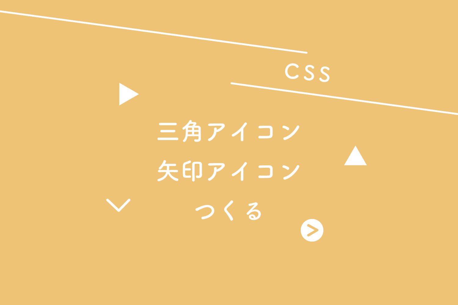
三角アイコン
疑似要素「:before」でテキストの横に三角アイコンをつけています。
See the Pen CSSだけで、三角アイコン by 125naroom (@125naroom) on CodePen.
HTML
<a href="#" class="arrow_s">三角アイコン</a>
CSS
.arrow_s {
  position: relative;
  display: inline-block;
  padding-left: 12px;
}
.arrow_s:before {
  content: '';
  width: 0;
  height: 0;
  border-style: solid;
  border-width: 6px 0 6px 8px;
  border-color: transparent transparent transparent #333;
  position: absolute;
  top: 0;
  left: 0;
  bottom: 0;
  margin: auto;
}
三角アイコン(丸背景あり)
疑似要素「:after」で丸背景をつけています。
「:before」で三角、「:after」で丸背景で、三角アイコン(丸背景あり)になります。
See the Pen CSSだけで、三角アイコン(丸背景あり) by 125naroom (@125naroom) on CodePen.
HTML
<a href="#" class="arrow_s_b">三角アイコン(丸背景あり)</a>
CSS
.arrow_s_b {
  position: relative;
  display: inline-block;
  padding-left: 22px;
}
.arrow_s_b:before {
  content: '';
  width: 18px;
  height: 18px;
  background: #333;
  border-radius: 50%;
  position: absolute;
  top: 0;
  left: 0;
  bottom: 0;
  margin: auto;
}
.arrow_s_b:after {
  content: '';
  width: 0;
  height: 0;
  border-style: solid;
  border-width: 4px 0 4px 6px;
  border-color: transparent transparent transparent #fff;
  position: absolute;
  top: 0;
  left: 6px;
  bottom: 0;
  margin: auto;
}
矢印アイコン(右向き)
疑似要素「:before」を使って矢印を作ります。
三角アイコンとは違って少し難しいですが慣れてしまえばいろんな形になるのでおすすめです。
See the Pen CSSだけで、矢印アイコン(右向き) by 125naroom (@125naroom) on CodePen.
HTML
<a href="#" class="arrow_r">矢印アイコン(右向き)</a>
CSS
.arrow_r {
  position: relative;
  display: inline-block;
  padding-left: 20px;
}
.arrow_r:before {
  content: '';
  width: 6px;
  height: 6px;
  border: 0;
  border-top: solid 2px #333;
  border-right: solid 2px #333;
  transform: rotate(45deg);
  position: absolute;
  top: 0;
  left: 0;
  bottom: 0;
  margin: auto;
}
矢印アイコン(左向き)
See the Pen CSSだけで、矢印アイコン(左向き) by 125naroom (@125naroom) on CodePen.
HTML
<a href="#" class="arrow_l">矢印アイコン(左向き)</a>
CSS
.arrow_l {
  position: relative;
  display: inline-block;
  padding-left: 20px;
  color: #333;
  text-decoration: none;
}
.arrow_l:before {
  content: '';
  width: 6px;
  height: 6px;
  border: 0;
  border-top: solid 2px #333;
  border-left: solid 2px #333;
  transform: rotate(-45deg);
  position: absolute;
  top: 0;
  left: 0;
  bottom: 0;
  margin: auto;
}
矢印アイコン(上向き)
See the Pen CSSだけで、矢印アイコン(上向き) by 125naroom (@125naroom) on CodePen.
HTML
<a href="#" class="arrow_o">矢印アイコン(上向き)</a>
CSS
.arrow_o {
  position: relative;
  display: inline-block;
  padding-left: 20px;
}
.arrow_o:before {
  content: '';
  width: 6px;
  height: 6px;
  border: 0;
  border-top: solid 2px #333;
  border-right: solid 2px #333;
  transform: rotate(-45deg);
  position: absolute;
  top: 0;
  left: 0;
  bottom: 0;
  margin: auto;
}
矢印アイコン(下向き)
See the Pen CSSだけで、矢印アイコン(下向き) by 125naroom (@125naroom) on CodePen.
HTML
<a href="#" class="arrow_u">矢印アイコン(下向き)</a>
CSS
.arrow_u {
  position: relative;
  display: inline-block;
  padding-left: 20px;
}
.arrow_u:before {
  content: '';
  width: 6px;
  height: 6px;
  border: 0;
  border-bottom: solid 2px #333;
  border-right: solid 2px #333;
  transform: rotate(45deg);
  position: absolute;
  top: 0;
  left: 0;
  bottom: 0;
  margin: auto;
}
矢印アイコン(丸背景あり)
疑似要素「:after」で丸背景をつけています。
「:before」で矢印、「:after」で丸背景で、矢印アイコン(丸背景あり)になります。
See the Pen CSSだけで、矢印アイコン(丸背景あり) by 125naroom (@125naroom) on CodePen.
HTML
<a href="#" class="arrow_r_b">矢印アイコン(丸背景あり)</a>
CSS
.arrow_r_b {
  position: relative;
  display: inline-block;
  padding-left: 22px;
}
.arrow_r_b:before {
  content: '';
  width: 18px;
  height: 18px;
  background: #333;
  border-radius: 50%;
  position: absolute;
  top: 0;
  left: 0;
  bottom: 0;
  margin: auto;
}
.arrow_r_b:after {
  content: '';
  width: 6px;
  height: 6px;
  border: 0;
  border-top: solid 2px #fff;
  border-right: solid 2px #fff;
  transform: rotate(45deg);
  position: absolute;
  top: 0;
  left: 4px;
  bottom: 0;
  margin: auto;
}
メモ
三角をつくるのにとても便利なサイトさんはこちらです。
さいごに