
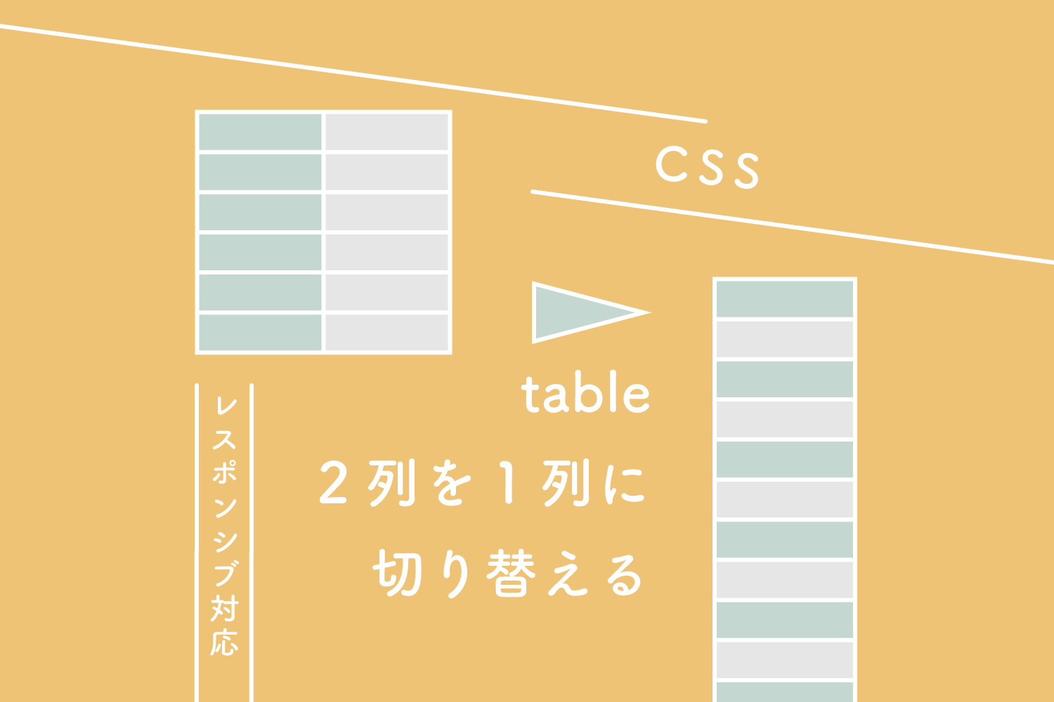

tableを1列にレスポンシブしたいんですけどー

CSSだけで簡単にできますよー
2列を1列に切り替える
ブレイクポイントの設定
601px以上は2列。
600px以下は1列。
See the Pen 【CSS】tableをレスポンシブ対応する、2列を1列に切り替える by 125naroom (@125naroom) on CodePen.
HTMLとCSSはこちら
HTML
<table>
  <tr>
    <th>名前</th>
    <td>テキストテキストテキストテキストテキスト</td>
  </tr>
  <tr>
    <th>名前</th>
    <td>テキストテキストテキスト</td>
  </tr>
  <tr>
    <th>名前</th>
    <td>テキスト<br>テキストテキスト</td>
  </tr>
  <tr>
    <th>名前</th>
    <td>テキスト<br>テキストテキスト</td>
  </tr>
  <tr>
    <th>名前</th>
    <td>テキスト<br>テキストテキスト<br>テキストテキストテキスト</td>
  </tr>
  <tr>
    <th>名前</th>
    <td>テキスト<br>テキストテキスト<br>テキストテキストテキスト</td>
  </tr>
</table>
CSS
table {
  width: 100%;
  border-collapse: collapse;
  border-spacing: 0;
  font-size: 14px;
}
table th {
  width: 22%;
  background: #fff27d;
  border: 1px solid #ccc;
  box-sizing: border-box;
  padding: 15px;
  vertical-align: middle;
  font-weight: bold;
  text-align: center;
}
table td {
  background: #fff;
  border: 1px solid #ccc;
  box-sizing: border-box;
  padding: 15px;
  vertical-align: top;
  text-align: left;
}
@media all and (max-width: 600px) {
  table th, table td {
    display: block;
    width: 100%;
    border-bottom: none;
  }
  table tr:last-child td:last-child {
    border-bottom: 1px solid #ccc;
  }
}
3列を1列に切り替える
ブレイクポイントの設定
601px以上は2列。
600px以下は1列。
See the Pen 【CSS】tableをレスポンシブ対応する、3列を1列に切り替える by 125naroom (@125naroom) on CodePen.
HTMLとCSSはこちら
HTML
<table>
  <tr>
    <th>名前</th>
    <td>テキストテキストテキストテキストテキスト</td>
    <td>テキスト<br>テキストテキスト<br>テキストテキストテキスト</td>
  </tr>
  <tr>
    <th>名前</th>
    <td>テキスト<br>テキストテキスト<br>テキストテキストテキスト</td>
    <td>テキストテキストテキストテキスト</td>
  </tr>
  <tr>
    <th>名前</th>
    <td>テキスト<br>テキストテキスト</td>
    <td>テキストテキストテキスト<br>テキストテキスト<br>テキスト</td>
  </tr>
  <tr>
    <th>名前</th>
    <td>テキスト<br>テキストテキスト</td>
    <td>テキストテキスト<br>テキスト<br>テキストテキスト</td>
  </tr>
  <tr>
    <th>名前</th>
    <td>テキスト<br>テキストテキスト<br>テキストテキストテキスト</td>
    <td>テキストテキストテキストテキストテキスト</td>
  </tr>
  <tr>
    <th>名前</th>
    <td>テキスト<br>テキストテキスト<br>テキストテキストテキスト</td>
    <td>テキストテキストテキスト<br>テキストテキスト<br>テキスト</td>
  </tr>
</table>
CSS
table {
  width: 100%;
  border-collapse: collapse;
  border-spacing: 0;
  font-size: 14px;
}
table th {
  width: 22%;
  background: #fff27d;
  border: 1px solid #ccc;
  box-sizing: border-box;
  padding: 15px;
  vertical-align: middle;
  font-weight: bold;
  text-align: center;
}
table td {
  background: #fff;
  border: 1px solid #ccc;
  box-sizing: border-box;
  padding: 15px;
  vertical-align: top;
  text-align: left;
}
@media all and (max-width: 600px) {
  table th, table td {
    display: block;
    width: 100%;
    border-bottom: none;
  }
  table tr:last-child td:last-child {
    border-bottom: 1px solid #ccc;
  }
}
だったら、4列を1列に切り替える
ブレイクポイントの設定
601px以上は2列。
600px以下は1列。
See the Pen 【CSS】tableをレスポンシブ対応する、4列を1列に切り替える by 125naroom (@125naroom) on CodePen.
HTMLとCSSはこちら
HTML
<table>
  <tr>
    <th>名前</th>
    <td>テキスト<br>テキストテキスト</td>
    <td>テキスト<br>テキストテキスト</td>
    <td>テキスト<br>テキストテキスト</td>
  </tr>
  <tr>
    <th>名前</th>
    <td>テキスト<br>テキストテキスト</td>
    <td>テキスト<br>テキストテキスト</td>
    <td>テキスト<br>テキストテキスト</td>
  </tr>
  <tr>
    <th>名前</th>
    <td>テキスト<br>テキストテキスト</td>
    <td>テキスト<br>テキストテキスト</td>
    <td>テキスト<br>テキストテキスト</td>
  </tr>
  <tr>
    <th>名前</th>
    <td>テキスト<br>テキストテキスト</td>
    <td>テキスト<br>テキストテキスト</td>
    <td>テキスト<br>テキストテキスト</td>
  </tr>
  <tr>
    <th>名前</th>
    <td>テキスト<br>テキストテキスト</td>
    <td>テキスト<br>テキストテキスト</td>
    <td>テキスト<br>テキストテキスト</td>
  </tr>
  <tr>
    <th>名前</th>
    <td>テキスト<br>テキストテキスト</td>
    <td>テキスト<br>テキストテキスト</td>
    <td>テキスト<br>テキストテキスト</td>
  </tr>
</table>
CSS
table {
  width: 100%;
  border-collapse: collapse;
  border-spacing: 0;
  font-size: 14px;
}
table th {
  width: 22%;
  background: #fff27d;
  border: 1px solid #ccc;
  box-sizing: border-box;
  padding: 15px;
  vertical-align: middle;
  font-weight: bold;
  text-align: center;
}
table td {
  background: #fff;
  border: 1px solid #ccc;
  box-sizing: border-box;
  padding: 15px;
  vertical-align: top;
  text-align: left;
}
@media all and (max-width: 600px) {
  table th, table td {
    display: block;
    width: 100%;
    border-bottom: none;
  }
  table tr:last-child td:last-child {
    border-bottom: 1px solid #ccc;
  }
}
さいごに
わー、できましたー
CSSは同じですよー