
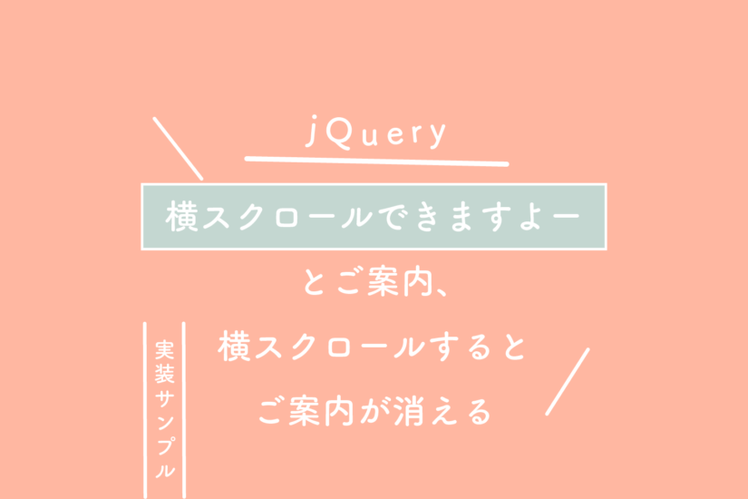
画像のホバーってできますか?
できますよー
サンプル
使えそうなホバー(:hover)さん。
画像編です。
LP作成時に役立ちます。
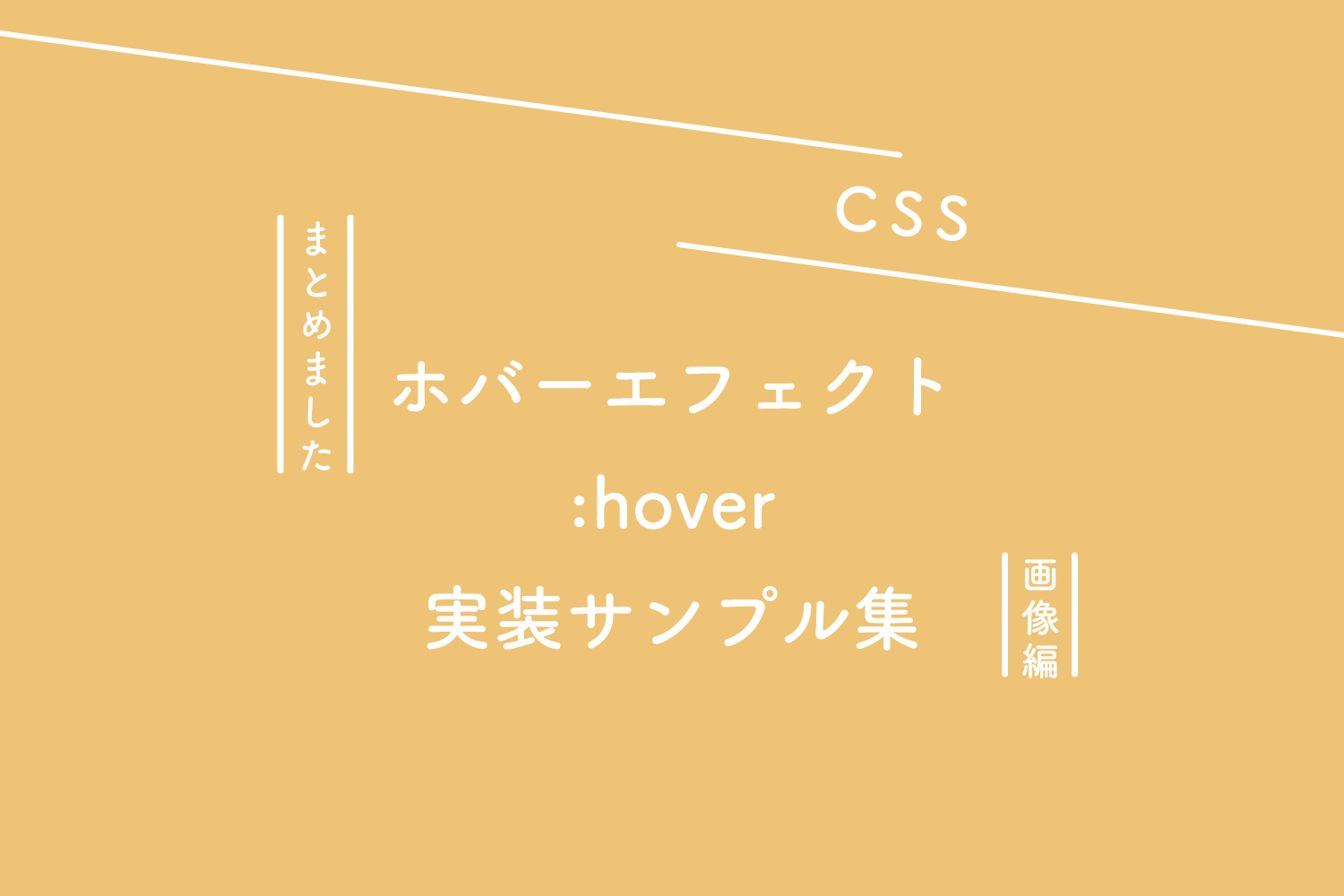
See the Pen 【CSS】ホバーエフェクト実装サンプル集(画像編)- image hover effects by 125naroom (@125naroom) on CodePen.
CSS
Normal → Zoom In #1
.s_zoomin_01 figure img {
  transform: scale(1);
  transition: .3s ease-in-out;
}
.s_zoomin_01 figure:hover img {
  transform: scale(1.3);
}
Normal → Zoom In #2
.s_zoomin_02 figure img {
  width: 100%;
  transition: .3s ease-in-out;
}
.s_zoomin_02 figure:hover img {
  width: 120%;
}
Zoom Out #1 → Normal
.s_zoomout_01 figure img {
  transform: scale(1.3);
  transition: .3s ease-in-out;
}
.s_zoomout_01 figure:hover img {
  transform: scale(1);
}
Zoom Out #2 → Normal
.s_zoomout_02 figure img {
  width: 120%;
  transition: .3s ease-in-out;
}
.s_zoomout_02 figure:hover img {
  width: 100%
}
Normal → Slide
.s_slide_01 figure img {
  margin-left: 30px;
  transform: scale(1.3);
  transition: .3s ease-in-out;
}
.s_slide_01 figure:hover img {
  margin-left: 0;
}
Normal → Rotate + Zoom In
.s_rotate_01 figure img {
  transform: rotate(0) scale(1);
  transition: .3s ease-in-out;
}
.s_rotate_01 figure:hover img {
  transform: rotate(15deg) scale(1.4);
}
Normal → Blur
.s_blur_01 figure img {
  filter: blur(5px);
  transition: .3s ease-in-out;
}
.s_blur_01 figure:hover img {
  filter: blur(0);
}
Normal → Blur + Gray Scale
.s_blur_02 figure img {
  filter: grayscale(0) blur(0);
  transition: .3s ease-in-out;
}
.s_blur_02 figure:hover img {
  filter: grayscale(100%) blur(3px);
}
Gray Scale → Normal
.s_gray_01 figure img {
  filter: grayscale(100%);
  transition: .3s ease-in-out;
}
.s_gray_01 figure:hover img {
  filter: grayscale(0);
}
Sepia → Normal
.s_sepia_01 figure img {
  filter: sepia(100%);
  transition: .3s ease-in-out;
}
.s_sepia_01 figure:hover img {
  filter: sepia(0);
}
Normal → Opacity #1
.s_opa_01 figure img {
  opacity: 1;
  transition: .3s ease-in-out;
}
.s_opa_01 figure:hover img {
  opacity: .5;
}
Normal → Opacity #2
.s_opa_02 figure {
  background: #111;
}
.s_opa_02 figure img {
  opacity: 1;
  transition: .3s ease-in-out;
}
.s_opa_02 figure:hover img {
  opacity: .5;
}
Normal → Flash
.s_flash_01 figure:hover img {
  opacity: 1;
  animation: flash 1.5s;
}
@keyframes flash {
  0% {
    opacity: .3;
  }
  100% {
    opacity: 1;
  }
}
Normal → Shine
.s_shine_01 figure {
  position: relative;
}
.s_shine_01 figure::before {
  content: '';
  position: absolute;
  top: 0;
  left: -75%;
  z-index: 2;
  display: block;
  width: 50%;
  height: 100%;
  background: linear-gradient(to right, rgba(255,255,255,0) 0%, rgba(255,255,255,.3) 100%);
  transform: skewX(-25deg);
}
.s_shine_01 figure:hover::before {
  animation: shine .75s;
}
@keyframes shine {
  100% {
    left: 125%;
  }
}
Normal → Circle
.s_circle_01 figure {
  position: relative;
}
.s_circle_01 figure::before {
  content: '';
  position: absolute;
  top: 50%;
  left: 50%;
  z-index: 2;
  display: block;
  width: 0;
  height: 0;
  background: rgba(255,255,255,.2);
  border-radius: 100%;
  transform: translate(-50%, -50%);
  opacity: 0;
}
.s_circle_01 figure:hover::before {
  animation: circle .75s;
}
@keyframes circle {
  0% {
    opacity: 1;
  }
  40% {
    opacity: 1;
  }
  100% {
    width: 200%;
    height: 200%;
    opacity: 0;
  }
}
さいごに
いろいろありますねー
工夫次第でなんなりとー